5. Use of the R Phyloseq package to study microbial diversity
Step 1. Load some necessary libraries
library(phyloseq)
library(Biostrings)
library(ggplot2)
theme_set(theme_bw())
Step 2. Convert the ASV from DADA2 into a Phyloseq object
If you look at the Excel file we generated at the end of the DADA2 step, we will see that the row names are the sample names and the column names are the long ASV sequences.

It is very clumsy to use the long sequences as the names of the ASVs. The following R codes will help to rename the ASV using the ASV as the prefix and a sequential number for the IDs. Also we do not delete the ASV sequences in case we need them later. Hence the sequences are stroed in an object called “dna” using a function “DNAStringSet” provided by the Biostrings.
# take a look at the row names of the seqtab.nochim object
rownames(seqtab.nochim)
# assign sample names to samples.out
samples.out=rownames(seqtab.nochim)
# Now we read in from a provided meta inforamtion file that tells us which sample is what treatment
meta=read.table(file="meta.txt",sep="\t",header=TRUE,colClasses="factor",row.names=1)
#Now we have 3 ingredient to build the phyloseq object, 1) ASV object, 2) sample information and 3) ASV taxonomy assignment
ps=phyloseq(otu_table(seqtab.nochim, taxa_are_rows=F),sample_data(meta),tax_table(taxa))
# Store the ASV DNA sequences to the object dna
dna <- Biostrings::DNAStringSet(taxa_names(ps))
names(dna) <- taxa_names(ps)
# We can even store the dna seuqences in the phyloseq object ps, although they will not be used in this tutorial
ps <- merge_phyloseq(ps, dna)
# Here we rename the ASV in the format of ASV1, ASV2, ... ASV100 ... etc
taxa_names(ps) <- paste0("ASV", seq(ntaxa(ps)))
Now the phyloseq object is ready for many downstream diversity analysis tools that are provided by the Phyloseq pacakge. We will practice a few of the basic ones.
Step 3. Make some alpha-diversity plots
Alpha diversity measures the number of taxonomy units (Genus, Species, OTUs, or ASVs) and their abundance within each sample. There are many different ways to measure/estimate the alpha diversity of the sample. The most common estimators for alpha diversity include
- Observed species - only count the total number of the species in the sample, does not care about the abundance)
- Shannon estimator - considers the number of species that are more abundant, disregarding the very low abundant species)
- Simpson estimator - considers the most abundant species, disregarding the low abudant species)
Depending on the question you ask, one may prefer one estimator over the other. Here we practice to calculate and plot the alpha diversity in our demo samples using these three most commonly used diversity measurements:
# use the plot_richness function provided by Phyloseq package
alpha_plot=plot_richness(ps, x="Concentration", measures=c("Observed","Shannon", "Simpson"), title="Antibiotics Treatment") + geom_boxplot() + theme(plot.title = element_text(hjust = 0.5))
# make sure the plots are shown in the order we desire
group_order=c("0 ug/ml","25 ug/ml","50 ug/ml","100 ug/ml")
alpha_plot$data$Concentration<-as.character(alpha_plot$data$Concentration)
alpha_plot$data$Concentration<-factor(alpha_plot$data$Concentration,levels=group_order)
# now generate the plot
alpha_plot
# Also save a copy of the plot in the PDF format
pdf(file="alpha_diversity_box_plot.pdf",width=8,height=6)
alpha_plot
dev.off()
OUtput:

Step 4. Make some beta-diversity plots
Beta diversity measures the similarity/dissimilarity between samples or groups of samples. Common ways to measure the similarity include:
-
Bray–Curtis dissimilarity: measure distance between two samples based on abundance or read count data, producing values from 0 (identical) to 1 (completely different)
-
Jaccard distance: measure distance between two samples based on the presence of absence of species (hence does not take abundance into account), also genearting values from 0 to 1.
-
UniFrac: measure distance between two samples based on the phylogetnic distances of species, can also include abundance inforamtion (weighted UniFrac).
The results of these measurements are pair-wise distance matrices. Next we can either compare groups of samples and perform some hypothesis testing to measure whether there is any statistically significant differences among the group; or we can simply visualize these data to observe whether there are any discernible difference. The later is commonly done by ordination - to order the objects in a way that reflect the distance between them. Common ordination methods include PCoA (Principal Coordinates Analysis) or MMDS (Non-metric multidimensional scaling). The later is a rank-based ordination method and thus is more robust in terms of accepting all types of distance measurement matrices.
The below example we first calculate the Bray–Curtis dissimilarity on our ASV table and then perform NMDS ordination for a plot to visualize the complex ASV read count data in a two-dimention manner.
ps.prop <- transform_sample_counts(ps, function(otu) otu/sum(otu))
ps.prop.nmds.bray=ordinate(ps.prop, method="NMDS", distance="bray")
nmds1=plot_ordination(ps.prop,ps.prop.nmds.bray,type="samples",color="Concentration") + geom_point(size=2) + ggtitle("RESISPART DEMO NMDS Plot") + theme(plot.title = element_text(hjust = 0.5))
nmds1$data$Concentration<-as.character(nmds1$data$Concentration)
nmds1$data$Concentration<-factor(nmds1$data$Concentration,levels=group_order)
nmds1

pdf(file="beta_diversity_nmds_plot1.pdf",width=6,height=6)
nmds1
dev.off()

nmds2=plot_ordination(ps.prop,ps.prop.nmds.bray,type="samples",color="Concentration") + geom_point(size=2) + ggtitle("RESISPART DEMO NMDS") + theme(plot.title = element_text(hjust = 0.5)) + geom_polygon(aes(fill=Concentration))
nmds2$data$Concentration<-as.character(nmds2$data$Concentration)
nmds2$data$Concentration<-factor(nmds2$data$Concentration,levels=group_order)
nmds1

pdf(file="beta_diversity_nmds_plot2.pdf",width=6,height=6)
nmds1
dev.off()
Output:

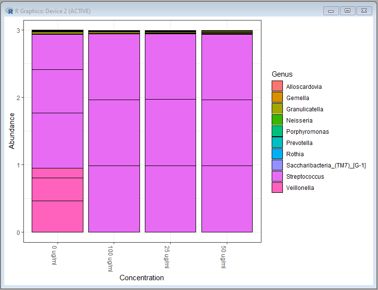
Step 5. Plot genus and species level bar charts
With Phyloseq, it is fairly easy to generate the percent bar charts for the most abundant species or genera:
ps.genus=tax_glom(ps.prop,taxrank="Genus")
top10.genus <- names(sort(taxa_sums(ps.genus), decreasing=TRUE))[1:10]
ps.top10.genus <- prune_taxa(top10.genus,ps.genus)
plot_bar(ps.top10.genus,x="Concentration",fill="Genus")

ps.species=tax_glom(ps.prop,taxrank="Species")
top10.species <- names(sort(taxa_sums(ps.species), decreasing=TRUE))[1:10]
ps.top10.species <- prune_taxa(top10.species,ps.species)
plot_bar(ps.top10.species,x="Concentration",fill="Species")
Genus level bar chart:
Species level bar chart:

Step 6. Identify differentially represented species
The functionality of R can be extended to other pacakge. In the following quick demo, we use a different package “MetacodeR” to visualize the differentially represented species in a comparion:
# Install the metacoder package
BiocManager::install("metacoder")
#
load("plot_body_site_diff.Rdata")
load("phyloseq_rm_na_tax.Rdata")
ps_species=tax_glom(ps,taxrank="Species")
ps_species_rm_na=phyloseq_rm_na_tax(ps_species)
mc=parse_phyloseq(ps_species_rm_na)
mc$data$otu_prop=calc_obs_props(mc,data="otu_table",cols=mc$data$sample_data$sample_id)
mc$data$tax_prop=calc_taxon_abund(mc,data="otu_prop",cols=mc$data$sample_data$sample_id)

comcol=mc$data$sample_data$Concentration
comp1="100 ug/ml"
comp2="0 ug/ml"
mc$data$diff_table <- compare_groups(mc, data='tax_prop', cols= mc$data$sample_data$sample_id, groups= comcol,combinations = list(c(comp1,comp2)))
mc <- mutate_obs(mc, "diff_table", wilcox_p_value = p.adjust(wilcox_p_value, method = "fdr"), log2_median_ratio = ifelse(wilcox_p_value < 0.5 | is.na(wilcox_p_value), log2_median_ratio, 0))
title="100 vs 0 ug-ml";
plot_body_site_diff(mc,comp1,comp2,"MetacodeR",1,"pdf","species",title)
Differentially represented species between antibiotic treatment and control samples:

Step 7. Export tables for more downstream analysis using MicrobiomeAnalyst
Phyloseq and R have many state-of-the-art bioinformatics tools and packages for downstream analyses. However the command-line interface usually is difficult to learn and use. In the next section we will use an online tool MicrobiomeAnalyst to help us perform more analyses in a very user-friendly mannor. Before doing so, we will export three tables that are required by MicrobiomeAnalyst:
library(tibble)
write.table(rownames_to_column(as.data.frame(t(otu_table(ps))),'#NAME'),file="otu_table.txt",sep="\t",quote=FALSE,row.names=F)
write.table(rownames_to_column(as.data.frame(meta),'#NAME'),file="meta_table.txt",sep="\t",quote=FALSE,row.names=F)
write.table(rownames_to_column(as.data.frame(tax_table(ps)),'#TAXONOMY'),file="tax_table.txt",sep="\t",quote=FALSE,row.names=F)